Landing a cover spot with a publication can do amazing things for an artist’s exposure. But what is the process behind getting this elusive coverage in the bag?
Not everyone is guaranteed a cover of a Rolling Stone magazine, for instance, and there are levels to locking one down. It’s part of any music publicist’s job to enter into conversations with outlets on covers and to find the opportunities best suited to their client.
There are a number of Australian music publications who offer these lucrative opportunities, yet we as music publicists know that it can sometimes be overwhelming to know where to start when it comes to even brokering these conversations.
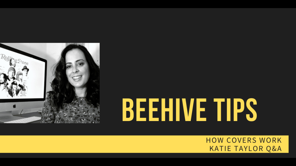
Luckily for us, we’ve got the scoop from within the magazine’s Australian ranks to break it down for us further! Katie Taylor is Rolling Stone Australia’s Creative Director; in the magazine’s short history, she’s been behind the production of some beautiful covers. From Tones And I through to Tash Sultana and the publication’s gorgeous bespoke artwork, Katie’s eye runs over everything to make sure the client and the publication is getting the most optimal of experiences.
Here, she tells us what artists and designers should look out for when it comes to magazine covers, and some tips and tricks of the trade.
What are the first things that will normally catch your eye (for the good and the bad) when it comes to cover work?
Some say art is subjective, I say it’s hard to say in words what good design is. But I’ll try all the same. A great cover design or any good design makes you feel something POWERFUL!
The feeling you get may bring you back to a memory, it may excite you, enlighten you… bring you a sense of calm.
When designing a cover we are aiming to design a feeling, we are wanting the person to see our cover and feel excited or intrigued; it should leave you wanting more. Ideally we want the cover to strike such a powerful chord with the reader that they want to give the magazine a place in their home forever.
A magazine cover starts with a great image, the biggest focal point on the page. A great cover shoot can make or break your cover design, no matter how good that headline is. It needs to complement our message/headline, show light and dark to give it depth, colours need to be assisted in the message not distract.
There are also a few simple design principles in place that need to be followed…
Legible typography, can I actually read the headlines?
Complementing colours, is there enough light and shade in this cover to stop it from looking flat/
Space to let the words breathe, words being cut off or having the kerning too tight will mean you lose your reader before they have even opened the magazine. It’s your job for the typography to communicate seamlessly.
Balance as a whole.
And is the cover on brand?
How did you first get into visual media, what brought you to the job you are in now?
Since I was 10 years old I was fascinated by design, whether it be fashion, interior, landscape, architectural, art or graphic design. I just loved to design, in all shapes and forms.
When I went to high school I chose Design Technology, Photography, Graphic Design and Art and I excelled in all classes (#humblebrag) – this is when I realised I loved to create. I especially love to create and see my work in a tangible form. So I chose my career path in Communications and Graphic Design. I enrolled in a Diploma of Design right out of school then got a scholarship to move onto a Bachelor of Graphic Design at Queensland College of Arts at Griffith University in Brisbane.
One morning my sister Poppy Reid called and told me Rolling Stone was being relaunched in Australia and asked for some advice setting up the creative team. At the time I was on maternity leave from my full time job as a Graphic Designer and the next day I was flying early down to Sydney to help assist in the production and creative setup.
I finished the two days with a full production schedule, had met with the printer and had given my advice on what The Brag Media needed to deliver a magazine. I also pitched a cover design for Tones And I. My ideas and designs were welcomed and then I was offered the role of a lifetime. I currently do this position while working another role and juggling motherhood.
How crucial would you say it is for artists or creatives to have their design work/team in check when it comes to preparing their release?
Fact checking, spell checking and making sure the whole team is across what you are about to release with any designed media, whether it be a magazine or billboard, is crucial. There is a lot of money and many people’s reputations at stake. As the designer, communication is key when working with your team, although you may not be the one responsible for fact checking, the question should be asked before finalising anything. This is why we have processes we need to go through before anything is printed or uploaded online.
Where do you think it is easiest for creatives and/or artists to fall short when it comes to executing covers?
We have access to so much online that you can fall into a trap of comparing yourself to others, to not have conviction in your design. To doubt yourself is to be human but to dull down your shine to conform is sacrilege.
Have there been any campaigns you’ve been part of recently / or have seen that still stick out in your mind as being excellent?
The March Rolling Stone cover shoot with Tash Sultana was personally and professionally such an epic experience. Especially collaborating with the amazing photographer G.G.MCG (Giulia McGauran) who I got to work really closely with. We started with a simple moodboard of the look and feel, this included words we wanted readers to feel looking at our cover, as well as textures, hairstyles, clothing and makeup.
I worked on all Art Direction, and the final shot we created was magic. Tash Sultana was a dream to work with plus the camera loves Tash, so we were definitely set up to succeed with our dream team.
What advice would you give to an artist who might not have a clue about how a cover works and the importance of a well executed cover? How can they educate themselves without overwhelming themselves at the same time?
A good cover starts with a clear idea of what you’re trying to say. Start with the basics, build a good foundation on who you are targeting and what your magazine is wanting to say to them. Then build your way up to creating a moodboard for your cover shoot or imagery. Like with any design, spend time on your brief so everyone is on the same page, this will save you a lot of time when trying to execute it.
What’s the one piece of advice you wished you had when you were first starting out?
As people we like to label ourselves, we are ‘(insert your job title)’ and this becomes our identity. I take interest in all sorts of designs, and I am not just one type of designer. The creative industry is forever evolving and changing and merging into every type of design. So some designers can feel out of touch or ‘irrelevant’ quickly, but the key is to take interest, it’s a lifestyle and passion, not a job.
Gain confidence in asking questions and surround yourself with people who inspire you. Also have conviction when presenting your designs, you need to be confident in yourself before people can have confidence in you.